This project was a challenge for me because it took a lot of creative ideas and design elements to make it come together. I chose these artists because they are some of my favorites, especially Mariah Carey during the Christmastime. I chose to do Christmas Eve because I like it a lot better compared to New Year's Eve. Overall, this project was very time consuming but fun.
Wednesday, December 21, 2016
Concert Poster
This project was a challenge for me because it took a lot of creative ideas and design elements to make it come together. I chose these artists because they are some of my favorites, especially Mariah Carey during the Christmastime. I chose to do Christmas Eve because I like it a lot better compared to New Year's Eve. Overall, this project was very time consuming but fun.
Friday, December 2, 2016
Candy Box
This is my candy box that I created. The hardest thing about this project for me was creating the character and the pow, wham, and the bang. Also, another hard thing for me was coming up with a concept. The easiest thing about this project for me was choosing the color scheme and creating the super powers. For this project, I learnt how to use the effects tool and to make my words look better. This project took a long time, but is probably one of my favorites!
Wednesday, November 30, 2016
Type Hierarchy Article
This article talks about the three levels of type hierarchy; headlines, subheads, and text. The headline is usually the biggest text and contains the most important information, the subhead helps organize your design into sections or group relative information together, and the text is usually the smallest size and is generally the meat of the design. There are seven ways to visually organize your design. Adjust your font sizes, choose a couple of contrasting typefaces, experiment with different styles and weights, add some color, pay attention to spacing, pay attention to proximity, and play with the orientation of the text.
The wording that will be included in my concert poster design:
Christmas Eve Celebration
T.D. Garden - Boston, MA
Date: Saturday, Decemeber 24, 2016
Time: 8:00pm
Artists: Selena Gomez, Ariana Grande, Mariah Carey, and DNCE
Sponsored by Toys for Tots
The wording that will be included in my concert poster design:
Christmas Eve Celebration
T.D. Garden - Boston, MA
Date: Saturday, Decemeber 24, 2016
Time: 8:00pm
Artists: Selena Gomez, Ariana Grande, Mariah Carey, and DNCE
Sponsored by Toys for Tots
Monday, November 21, 2016
Candy Box Title
Monday, November 7, 2016
Candy Box Character
This is my character for my candy box. His name is Pablo the Power Pill. He is the leader of all of the power pills and has all of their powers combined. I created him to look like a pill, but to also look like a cartoon character. The hardest thing about creating him was trying not to use black outlines. The easiest thing about creating him was coloring and shading him.
Thursday, October 27, 2016
Sugar Skull
I have learned many new things during this project. In Illustrator, In learnt how to make outlines using the pen tool and how to make curved lines. Using Photoshop, I learnt how to apply color by airbrushing using the paint tool. My favorite design on my skull is the henna design on its forehead because it looks like a stained glass window and it is very pretty. The hardest thing in this project for me was figuring out my design element. The easiest part of this project for me was the airbrushing.
Monday, September 26, 2016
Sugar Skull
I like the sugar skull on the left because it is very colorful and I would like to use those colors for my project. I also like how the skull is wearing headphones and how pretty the eyes are.
I like the sugar skull on the right because the big rose on the forehead is very pretty. I also like how it is simple but elegant at the same time. I would like to include a rose like that on my project.
On both of these sugar skulls, I like how the noses look like an upside down heart and how pretty they are.
Self Portrait
I chose the ocean background because I am an Aquarius. I put paw prints on the J because I love animals. I have two cats, a dog, and fish. I work at Stop and Shop and that is their logo. I love to bake, so I made the letter M out of pink frosting and I made a slice of Pumpkin Pie fit in the gap of the letter. I put a cruiser bicycle on top of the M because I love to ride my pink cruiser bike around my neighborhood. The letter D is made out of colorful puzzle pieces because I am Autistic. I feel like it is who I am and I'm not afraid of telling people. The Garnet in the middle of the D is my birthstone. The fish in the water are the kinds of fish that I own. The easiest thing for this project for me was coming up with a design idea. The hardest thing for this project for me was figuring out the how the tools worked.
Monday, September 19, 2016
Smiley Face
For my Smiley Face project, I chose to make a witch because it is Halloween season and I love Halloween. For this project, I learned how to drag pictures from the internet and how to remove their background. I also learned how to warp the witch hat to make it fit better on her head.
Friday, September 9, 2016
Typography
I chose the letter J because it is the first letter of my first name. I chose the ombre blue and pink background because I thought that it looked pretty. I chose different fonts to make the picture abstract. The most difficult part about this project was choosing a design idea to do.
Wednesday, August 31, 2016
2016 Design Trends
Motion
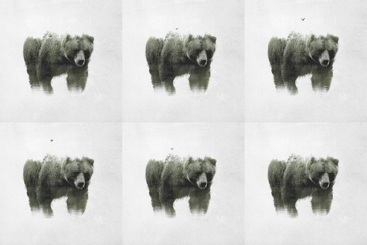
I love this type of design trend because even though the colors are grey and dull, it is still a beautiful piece. The movement gives the picture life. The picture also shows a lot of different textures to make the bear seem real to the viewer.
Geometric Shapes
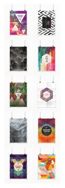
I love this design trend because there are so many different hues and textures going on. With this design you can be very creative with how you want your piece to look. I also love how they have a 3D effect.
Whimsical Illustrations
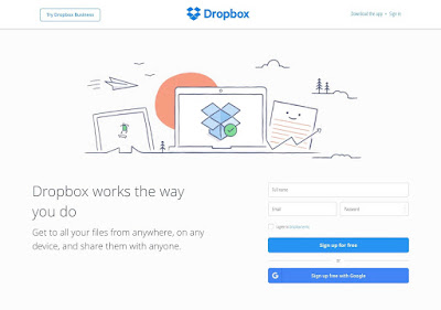
I love this design trend because the doodles are a nice design element to add character to anything. I also love this design trend because you can add all sorts of different textures such as sketch lines and brushstrokes. You can also add many different colors to the piece.
In Graphic Arts this year, I would like to do more hands on projects that I can design and build because I like doing those kind of things. I would also like to learn more about Photoshop because I've always found it interesting. My hobbies are doing arts and crafts, riding my bike, listening to music, baking, and playing with my animals.

I love this type of design trend because even though the colors are grey and dull, it is still a beautiful piece. The movement gives the picture life. The picture also shows a lot of different textures to make the bear seem real to the viewer.
Geometric Shapes

I love this design trend because there are so many different hues and textures going on. With this design you can be very creative with how you want your piece to look. I also love how they have a 3D effect.
Whimsical Illustrations

I love this design trend because the doodles are a nice design element to add character to anything. I also love this design trend because you can add all sorts of different textures such as sketch lines and brushstrokes. You can also add many different colors to the piece.
In Graphic Arts this year, I would like to do more hands on projects that I can design and build because I like doing those kind of things. I would also like to learn more about Photoshop because I've always found it interesting. My hobbies are doing arts and crafts, riding my bike, listening to music, baking, and playing with my animals.
Subscribe to:
Comments (Atom)


